#UX
#IxD
#mobile
#Figma
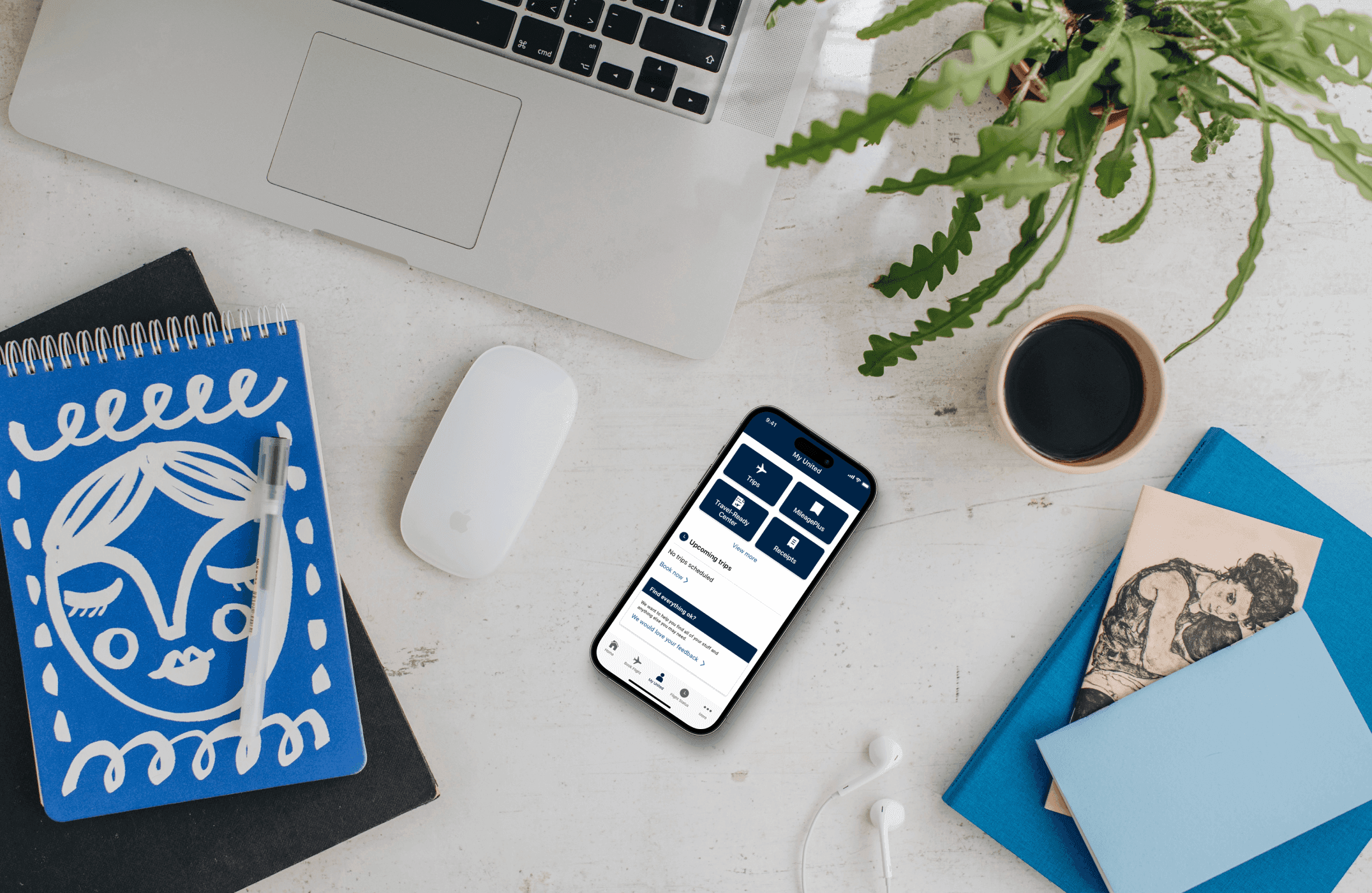
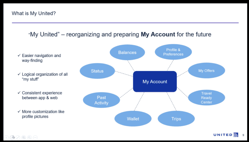
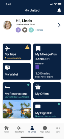
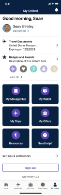
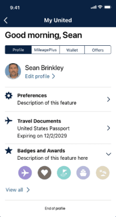
My United
The My United initiative was a way to organize a traveler’s most important items into one central location. The previous version of the application involved navigating to an ambiguous “More” menu where everything was stashed away under sub-menus. This new and improved placement allowed the user to easily get to the most important items they would need at any given point of the flow.
Timeline
Role
Why is the world broken?
United's app buried essential travel information under a cluttered "more" menu, causing frustration and confusion. Over half of users struggled to access vital trip details, significantly exceeding industry expectations. As a lead designer, I tackled this challenge, aiming to simplify and streamline the user experience.
The user

Mark, the Frequent Flyer
Name: Mark Johnson
Age: 47
Occupation: Senior Marketing Manager
Location: Chicago, Illinois
Marital Status: Married, 2 children
Income: $120,000
Goals
1
Efficiency
Wants to book flights and manage travel quickly and easily.
2
Time-saving
Appreciates features that save him time at the airport, like mobile check-in and boarding passes.
3
Comfort
Values a comfortable travel experience, including reliable service and amenities.
Challenges
1
Long security lines and check-in procedures
These can be time-consuming and frustrating, especially during peak travel times.
2
Lost or delayed baggage
This can be a major inconvenience, especially for short trips.
How do we fix it?
Allowing the user to access their most important day of travel items quickly and efficiently.
Early iterations
We utilized competitive analysis and industry research to ideate on different solutions to our problem. After conducting a few brainstorm sessions with the Customer Management MBT, we were ready for early iterations of potential MVPs.
Version 1.0
After iterating and getting feedback from stakeholders for 3-4 months, we were able to finalize a direction and begin testing with small monitored sessions. From there, a beta was rolled out to select MileagePlus members and eventually implemented to all users.

Metrics
1
30% rise in users accessing day-of-travel information
within the app after "My United" launch.
2
50% reduction in the number of app taps
required to access key travel shortcuts.
3
5% reduction in customer service calls
related to travel information inquiries.
Tools
Figma
Conclusion
My United successfully streamlined the travel experience within our mobile app by making key day-of-travel shortcuts easily accessible. Users now experience significantly increased access to information, reduced navigation steps, and faster completion of tasks, leading to a marked decrease in frustration. The feature's intuitive design has resulted in enhanced user satisfaction, increased engagement within the app, and improved operational efficiency. This project demonstrates the value of prioritizing user needs in driving both positive experiences and business success.

