United Safety Hub
Bridging design systems and research insights to transform a legacy safety platform into a modern, compliant user experience
Overview
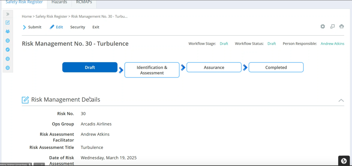
United Safety Hub replaces the legacy ETQ system with a modern safety risk management platform. As the UX Designer, I ensured external vendor compliance with United's Orion design system while translating research findings into 40+ actionable design specifications for Policy Owners and SMS Representatives.

The Challenge
The external vendor delivered a platform with sub-par user flows and failed to follow United's Orion design system standards.
Initial testing revealed a SUS score of 42/100—well below the industry standard of 68. Users struggled with inconsistent UI patterns, confusing terminology, and nested workflows that obscured critical actions.
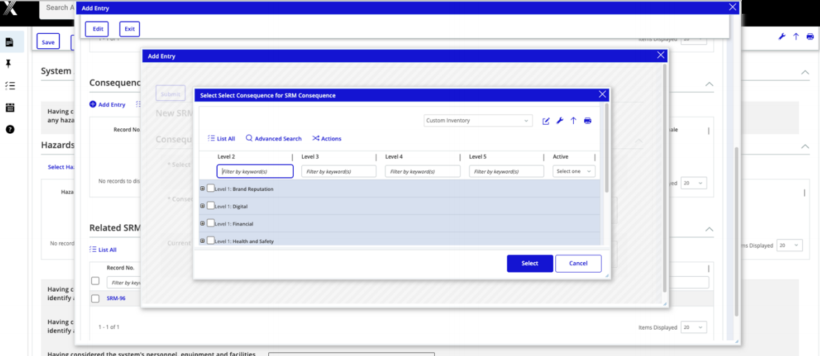
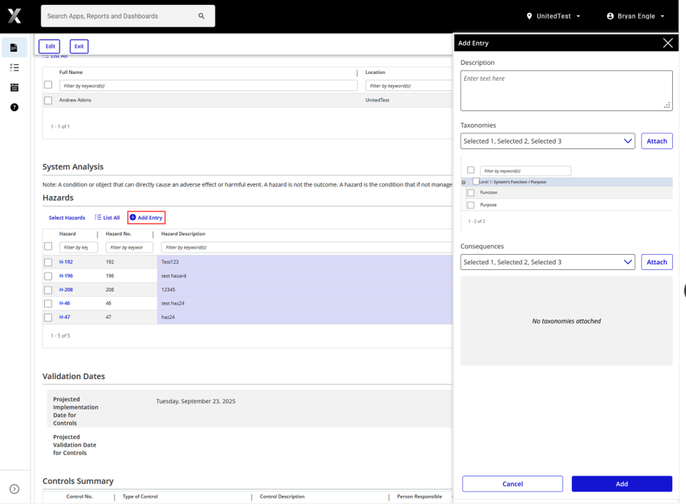
Key Issues: Navigation confusion, terminology mismatches, complex nested popups, inconsistent design patterns, non-actionable error messages
I feel like it's just a reorganization of the data from ETQ… I'm not seeing a massive difference, it's all still overly complicated to me.
My Approach
I served as the bridge between research insights and implementation, ensuring vendor accountability while maintaining design system integrity.
Research Foundation
Two rounds of moderated usability testing with 15 participants across 60-minute remote sessions provided the data foundation for design decisions.
Key Activities
- Audited vendor deliverables against Orion design system standards, documenting 40+ violations
- Translated research insights into specific, implementable design requirements
- Created detailed specifications covering UI styling, grids, forms, and navigation patterns
- Collaborated with developers to ensure proper implementation and system compliance
- Validated improvements through iterative testing rounds
Design Solutions
I organized findings into three priority categories, creating comprehensive specifications that addressed both UX workflows and UI inconsistencies.
- Single pathway to actions
- Clear breadcrumb trails
- Consistent navigation patterns
- Standardized UI components
- Clear primary actions
- Guided user workflows
- Visible main pathways
- Auto-refresh feedback
- Consistent terminology
- Unified button patterns
- Standard action labels
- Clear exit options
UI Design & Components
- Standardized button classes, removed unnecessary icons, aligned spacing
- Converted navigation icons to United Black, replaced non-standard assets
- Audited typography, updated color palette to match Orion standards
- Aligned radio buttons, checkboxes, and form elements to design system
Data & Tables
- Implemented alternating row colors, fixed column wrapping
- Removed redundant columns, optimized grid scaling
- Corrected color discrepancies, improved information hierarchy
Interaction Patterns
- Locked popup dimensions, fixed window state issues
- Created new navigation classes for consistent behavior
- Removed redundant breadcrumbs, simplified dashboard widgets
Impact
Between testing rounds, targeted improvements drove measurable results and shifted user sentiment from frustration to cautious optimism.
Round 1: Frustration with complexity and inconsistency
Round 2: Recognition of potential with identified refinement needs
I can see the vision. But I do think there's just a little bit of tweaks here and there.
Design System Compliance
- Established vendor accountability framework for ongoing Orion adherence
- Created reusable component specifications for future development phases
- Documented design patterns to prevent regression and ensure consistency
Key Takeaways
Design systems need active governance
Documentation alone isn't enough—vendors require clear specifications, regular audits, and implementation validation to maintain consistency at scale.
Research translation is a distinct skill
Converting qualitative feedback into specific, implementable requirements demands both empathy for user needs and technical understanding of development constraints.
Iterative validation drives confidence
The 18-point SUS improvement validated our prioritization approach and demonstrated that design system compliance directly impacts user experience.
Once United rolls out a system we're stuck with it for a while. I would prefer we spend more time on this now to get it right instead of putting it out as is.